Pentaho Tools :

Pentaho C-Tools(CDE,CDF,CDA),Pentaho CE & EE Server,OLAP-Cubes,Analysis using Pivot4J, Saiku Analytics, Saiku Reporting, Ad-hoc Reporting using Interactive Reporting Tool,Dashboards,Reports using PRD, PDD,Data Integration using Kettle ETL,Data Mining usign WEKA,Integration of Servers with Databases,Mobile/iPad compatible Dashboards using Bootstrap Css,Drilldown dashboards,Interactive Dashboards

Thursday 30 March 2017

Line Graph Based on Multi Select Parameter in Pentaho CDE

In this example, one can learn how to make multi-select parameter values as series in Pentaho CCC line graph. 

Display two lines when selected 2 values in drop down
 Display 1 line when selected 1 value in drop down
  Display 1 line when selected another 1  value in drop down

NOTE : 
Make CrossTabMode=False, Series in Rows = False and make sure the chart listens to the parameter.

Look at the SQL code to understand how to pass a multi select parameter in CDE or PRD

Download : Click Me

1) Dashboard source code
2) Images
3) Sample Data for this example (.ktr file) OR .backup file (restore it any of postgresql database)


Saturday 25 March 2017

Right Chart Type - What pentaho is saying ?


Blogging the pentaho documentation information.

All rights are owned by Pentaho for below documentation info.

There are 17 JFreeChart chart types built into Report Designer, with some of them changing significantly based on which data collector you choose.
If you want to show the strength of a trend for a single value over time, the best chart types are:
  • Line
  • Area
  • XY StepArea
  • XY Step
  • XY Line
If you are directly comparing two or more related values, the best chart types to choose are:
  • Pie
  • Ring
  • Bar
  • Line
  • Area
  • Radar
If you want to show how one set of values directly affects another, the best chart types are:
  • Bar line combination
  • Waterfall
If you are comparing a large number of data points, the best chart types are:
  • XY Difference
  • XY Dot (Scatter plot)
  • Bubble
  • Pie Grid (Multi-Pie)
If you need to show a trend among a small number of related numerical data points, a sparkline chart may be appropriate. However, sparkline charts require comma-separated values for input, so if your data is not in that format, you must create a function to pull it from your data source and put commas between each data point.

Thursday 23 March 2017

Hosted Demo Server - Pentaho Enterprise 6.x (http://demo.pentaho.com )

This post is useful for the community guys who want to explore pentaho enterprise server

Copy paste below demo url in your web-browser.

Pentaho Enterprise Demo Sever URL 
http://demo.pentaho.com/pentaho/Login
User Name /Password : guest/guest

You will  be asked to fill the evaluation access form. Fill it and access the demo server as guest.
http://www.pentaho.com/access-evaluation-path 


Once you login as guest you can play around build-in server tools

1) Analysis Report(CUBES)
2) Interactive report designer (Self Service reporting)
3) Enterprise dashboard designer


Browse the repository for out-of-the box examples and explore enterprise features.

Tuesday 21 March 2017

Tip : Pentaho PRD : Conditional background colour for cells in Pentaho PRD

select the number-field or text-field from detail band and write IF condition expression/formula for bg-color property as shown in below images to get the conditional background colour for cells 

If you have to show more than 2 colors write nested if condition in else block and continue till your requirement ends. 


Expression : =IF([passfail]="PASS";"green";"red")


   Sample output: 

:-)

Tip : Pentaho PRD : Cascaded drop down parameter(s) in Pentaho Report Designer

Display the month names based on selected year.

Query-1 :  Extract Year  

SELECT DISTINCT
    EXTRACT(YEAR FROM "DATE")::integer as year
FROM dimcalendar 

Query-2 : Extract Month From selected Year ( In some cases report needs to display till current month)

select DISTINCT to_char("DATE", 'Month')::text Mon from dimcalendar
where EXTRACT(YEAR FROM "DATE")::integer = ${paramYear}


:-)

Tip : Pentaho PRD : Remove empty space between bars in bar graph

In Pentaho PRD to reduce the space gap between items (bars) of the bar chart (or bar with line chart ) follow as shown in images. Play with item-margin property value. 

NOTE: Graphs use JFree technology 

CASE -1 : item-margin : 0.2 (20%)


CASE-2 : item-margin =0 (0%)


Learning never exhausts the mind :-)

Tip : Pentaho PRD : Calculated field in Pentaho Report Designer ( Calculate Percentage field)


Lets say sub1, sub2, sub3 are the query fields . To calculate Percentage on these 3 fields use below formula in

1) Drag and drop number field PRD palette (from left side).
2) Click on + button to write formula in expression editor and write formula as follows.
Formula :
=(([sub1]+[sub2]+[sub3])/300)*100


User Based Security in Pentaho CDE Dashboards

Hi Community,

I had a request from a folk to get the dashboards and data displayed in it based on logged in user.  I have come across many threads and links from pentaho and stack over flow forums and found there was no definite procedure to implement it instead had the sentence help, so thought of documenting it and here you go.

In this article, you will quickly learn below

1) How to create parameter for loggedin user in Pentaho CDE( user session variable)
2) How to create  users and assign roles ( Power User role).
3) Hiding the CDA and CDF files for end users.
4) Technique used to display the user name on dashboard.
5) Hiding table headers using CSS script

Image : Dashboard development Story (Click on image to get best view of the content on slide)


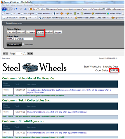
Image-1 : (Click on image to get best view and observe logged in user and data )

Image-2 : (Click on image to get best view and observe logged in user and data )

CSS used in this dashboad : 
.sorting_disabled
{ display:none;
}


#paramUserLabel{
    margin-top:10px;
}
body{
    margin-top:25px;
}

.col-xs-2 {
    width:135px;
}


Download Source code :  Click Me
1) Presentation PPT
2) Sample data used
3) Dashboards export

Deployment procedure : Do as an admin user
1) Create "pdi_training" data base in latest postgres
2) Execute the backup file
3) Create users and assign role(s) as explained in PPT
 4) Upload the zip file and log in into the server with different users and observe user based data.


I hope it helps some one in community.! :-) 

Monday 13 March 2017

Re-Blogging : Drill down chart in pentaho report designer (PRD)

Hi,

This is a re-blog from

http://arubawayne.blogspot.in/2011/08/creating-drill-down-on-charts-within.html


Creating drill down on charts within Report Designer

Report Designer has the capability of creating charts which you can link the individual values to other reports, creating a drill down chart. This document will help you to create a working example of this using the sample data that comes with Pentaho in addition to a canned sample report that comes with Pentaho (the Order Status report located under the Steel Wheels > Reporting solution folder).
  1. Create a new report with Report Designer and add a JDBC connection with the Sample Data and enter the following SQL into the Query Dialog Box.SELECT "ORDERFACT"."STATUS", sum("CUSTOMER_W_TER"."CREDITLIMIT") AS Sales FROM "ORDERFACT" INNER JOIN "CUSTOMER_W_TER" ON "ORDERFACT"."CUSTOMERNUMBER" = "CUSTOMER_W_TER"."CUSTOMERNUMBER" WHERE "ORDERFACT"."STATUS" NOT LIKE 'Shipped' GROUP BY "ORDERFACT"."STATUS" ORDER BY "ORDERFACT"."STATUS" ASC

  1. Add a chart to the Report Header in your new Report and configure it to be a bar chart showing the sales per order status
  1. Link to the existing Order Status report located on the BI Server under Steel Wheels\Reporting folder


    Make sure the formula reads as follows:

    =DRILLDOWN("local-prpt"; NA(); {"oStatus"; ["chart::category-key"] | "showParameters"; [STATUS] | "solution"; "steel-wheels" | "path"; "reports" | "name"; "Order Status.prpt"})
Preview the Report in HTML and click on the "On Hold" bar to see the drilldown action:


Saturday 11 March 2017

Saiku Analytics free plug-in installation in Pentaho 7.0 Community Server

Hi,

In this post you can learn how to install saiku analytics plug-in installation and license apply in pentaho 7.0 CE server.

Download the presentation for step by step procedure.

It's been long time I had written some useful learning's or findings in petnaho , jasper or kettle or talend. Now, I am back to the drawing board after a long break. Hope this article will help you to get start with saiku in pentaho.

Here are the sample screen shots.

Sample slide -1 : (Click on image to get best view of content)
Sample slide-2 : (Click on image to get best view of content)

Sample slide-3 : (Click on image to get best view of content)


Click me to download presentation.

NOTE : presentation is password protected.


Hope this helps someone in the community who are installing saiku for the first time in pentaho 7.0 community server.